By Matty Cartwright · MIT Sloan 15.960 Independent Study · Supervised by Prof. Ben Shields
May 2026
This is Part Two of an MIT Sloan independent study on AI-assisted content production. Part One covered short-form video. Part Two covers carousel automation.
Part One of this independent study argued that organic short-form video can become more systematic when creators use AI agents to identify patterns, study what outperforms, and feed those signals into new content decisions. That report focused on video because I had a live account, a visible baseline, and measurable results. The video workflow had a natural quality floor: AI surfaced the hook and the script outline, but I still stood in front of a camera and said the words myself. My face, my voice, my delivery. Even when the strategy was AI-assisted, the content was still human.
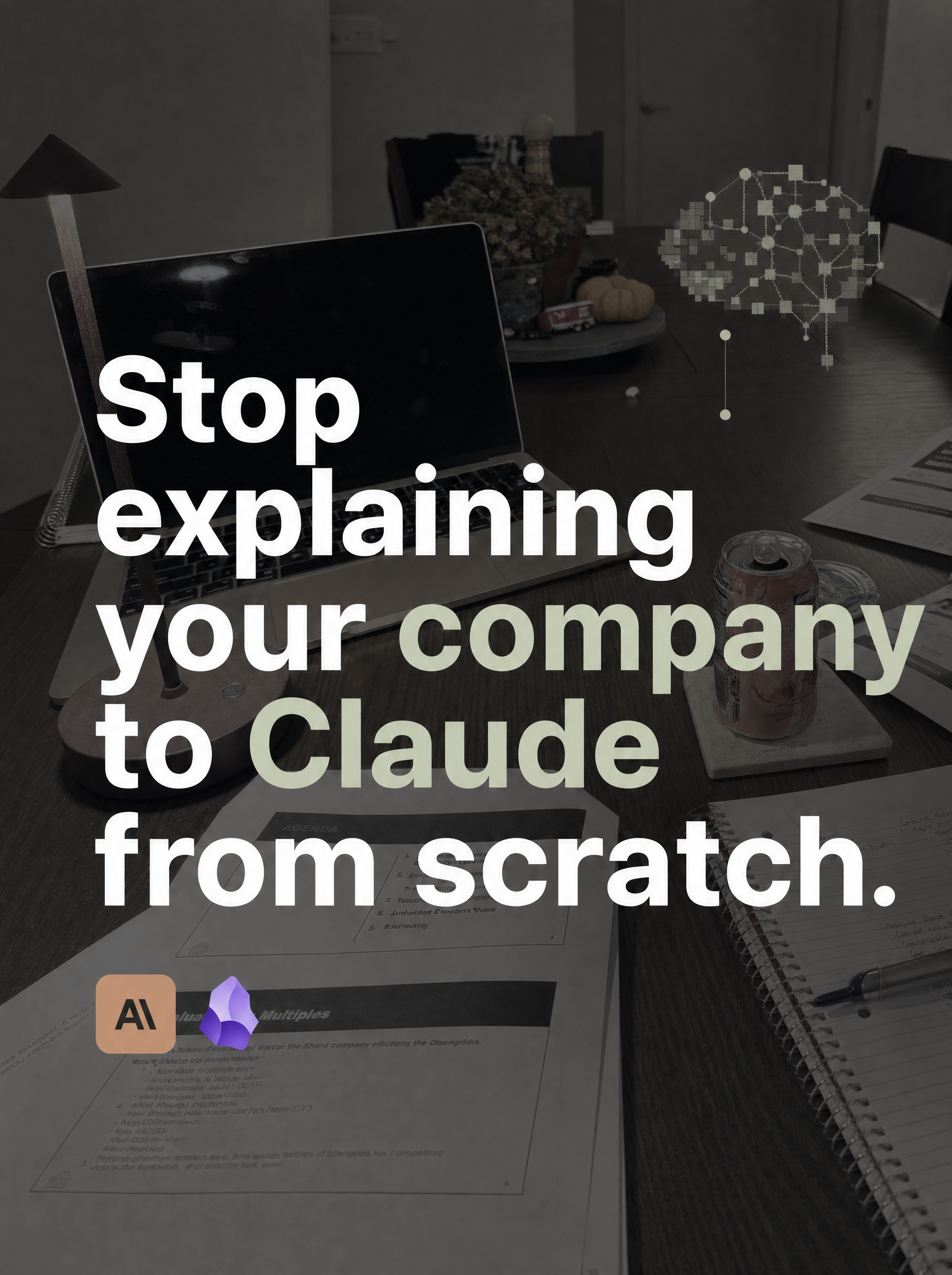
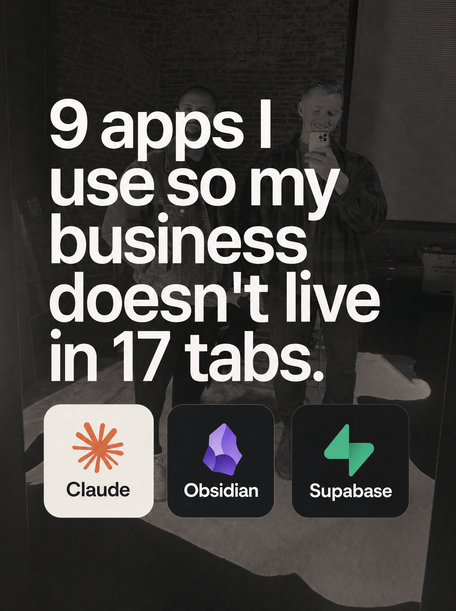
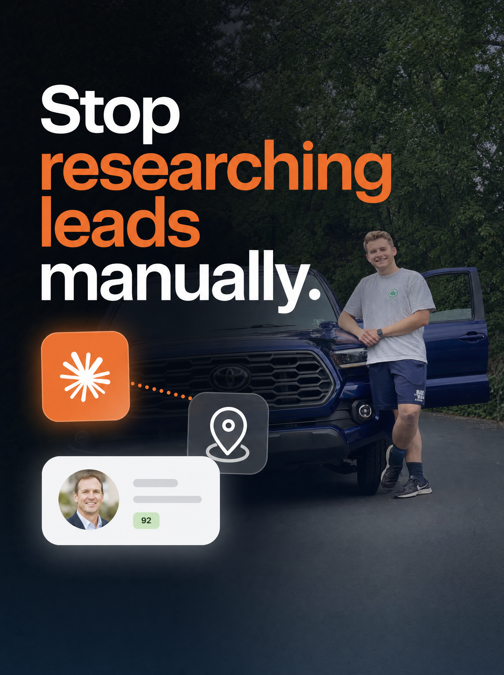
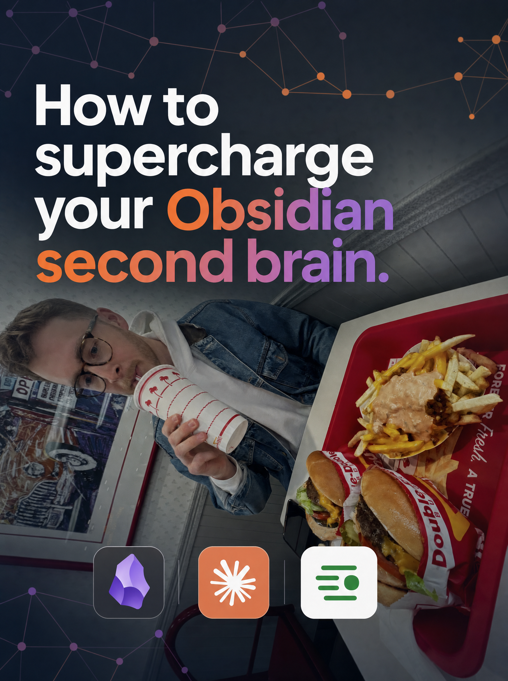
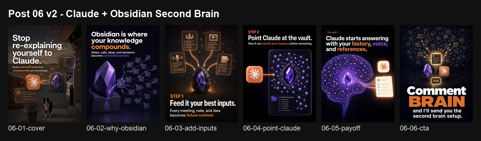
Part Two picks up the original subject of the proposal: carousel automation. The plan was to build an automated Instagram carousel campaign, publish repeatedly, track performance, and use the data to improve. I assumed the hard part would be measurement. I was wrong. The hard part was getting the system to produce carousels that I could post without damaging my credibility. This report documents the full journey: six production workflows tested, five abandoned, a research system that replaced guesswork with data, and the one pipeline that produced output I was willing to put my name on.
Why Carousels Are Sneaky Hard
Video production has obvious effort baked in. You film, you edit, you cut, you color correct, you add captions. Nobody questions how long it takes because the labor is visible. Carousels look simple by comparison: text on slides, a few images, done in 20 minutes. That is the trap. The creative labor in a good carousel is almost entirely frontloaded into decisions that happen before you ever open a design tool. Which hook pattern to use, which layout to follow, what visual style fits the brand, what CTA to end with, how many slides, what order, what photos. Get those decisions right and the production is fast. Get them wrong and no amount of design polish saves the post.
The deeper difference between Part One and Part Two is about where the human shows up. In video, I am the content. Even if AI wrote the script outline, the viewer sees a real person talking, and that anchors trust. In carousels, the slides are the content. If AI generated the text, the layout, and the background, the viewer is looking at machine output directly. A misspelled word, a fake app icon, an uncanny photo treatment, a gradient that screams "template," any of these signals to the viewer that what they are looking at was made cheaply. For a personal brand account, that is brand damage. You might not be able to define exactly what makes a carousel feel "off," but you know it when you see it.
This is why the most successful carousel creators in the research dataset use real photographs of themselves, their workspaces, or their actual screens as slide backgrounds. They use lifestyle images that prove they are real people with real setups. The photo is their authenticity layer, the same way my face on camera was mine in Part One. The text sits on top of a real image, and that combination is hard for a machine to fake convincingly.
Building the Research Database
Before I could produce carousels worth posting, I needed to understand what "worth posting" looked like in my niche. I did not want to rely on my own taste, because taste without data is just preference. So I built a structured research system.
The pipeline works in three stages. First, I used Apify (a web scraping platform) to pull Instagram carousel posts from 12 accounts in the AI and solopreneur content space: creators like @sabrina_ramonov, @buildwithcody, @raycfu, @softgirlnocode, and others who consistently post educational carousels. For each post, the scraper collects the caption, engagement counts (likes, comments), post URL, and downloads every slide image.
Second, I sent each set of slide images through OpenAI's GPT-4o Vision model with a structured analysis prompt. The model examines each slide and returns fields for hook text, hook type (listicle, how-to, bold claim, etc.), layout pattern (text-over-image, centered text, screenshot tutorial), aesthetic style, color palette, font details, background type (photo, solid color, texture), CTA text and type, slide descriptions, and content niche.
Third, all of that structured data is stored in a Supabase database table called carousel_research. Each row is one post, and each row has over 20 analyzed fields. This is the dataset that every finding in this report comes from.
By the end of the project, the database held 27 analyzed posts across 12 accounts. The dataset is small, but it produced clear patterns that contradicted my design instincts and changed how I approached production.
What the Data Says About Hooks
Listicle hooks average 4x more engagement than bold claims. The two largest posts in the entire dataset, at 44,000 and 36,000 likes respectively, both used the same formula: "[Number] [things] I use to [outcome]." The bold claim format ("Stop doing X" or "You're doing X wrong") is the most common hook in the niche and the worst performer. That gap between popularity and performance is one of the clearest signals in the data.
What the Data Says About Visuals
Photo backgrounds outperform solid color backgrounds by 35x in average engagement. The "clean minimalist" instinct, flat color with centered text, is dead on arrival in this niche.
What the Data Says About CTAs
Comment-gate CTAs ("Comment BRAIN and I'll send you the setup") drive 69x more comments than posts with no CTA. The mechanism is straightforward: comment-gate posts feed the algorithm with engagement and funnel interested viewers into DMs. Every educational carousel in the dataset that used a comment gate outperformed its non-CTA equivalent.
Brand Differentiation Signals
Two findings from the research applied directly to my own positioning. Every winning post in the dataset used bold sans-serif typography for headlines. Zero used serif. My brand system uses a serif display typeface (Fraunces), which means I am playing in unclaimed space. The closest competitor, @raycfu, recently started experimenting with a serif-adjacent warm paper texture and saw strong early traction, but nobody else in the niche occupies that territory.
The palette story is similar. The dominant color schemes across all 27 posts are black and white with accent pops of coral, purple, or magenta. My brand color, burgundy (#C43B4F), does not appear in any competitor palette. The research database made these gaps visible in a way that scrolling through Instagram never would.
Six Workflows, Five Failures
The real work of this project was not the final output. It was the process of building and tearing down production systems. When you spend days constructing an entire carousel pipeline, generate your first batch of slides, and the output is so bad you would never post it, you scrap it and start over. That happened five times before something stuck.
An important timeline note: OpenAI released GPT Image 2 on April 21, 2026, but it did not gain widespread marketing traction until late April and early May. I did not discover it until mid-May. The first five workflows below were all built before I had access to GPT Image 2, and the text-rendering limitations of earlier models were a major reason those approaches failed. Knowing that context makes the failure taxonomy more useful: these were not bad ideas executed poorly. They were reasonable ideas built on tools that were not ready yet.
Workflow 1: GPT Image 1 with baked-in text. I fed personal photos into OpenAI's first-generation image model and asked it to compose complete carousel slides with text overlaid directly in the image. The model could produce images, but the text rendering was unreliable, the typography was generic, and everything came out looking like stock content. It proved that the concept of AI-generated carousel slides was technically possible. It also proved that "technically possible" and "worth posting" are different problems.
Workflow 2: Sharp/SVG compositing. I wrote a Node.js script that programmatically composited text over photographs using the Sharp image processing library, with SVG handling the layout and typography. The output was polished and had pixel-perfect text rendering. The problem was scope: it only solved one slide type, the cover. Building it into a full 5-to-8 slide system would have meant constructing a rendering engine from scratch. I moved on.
Workflow 3: Puppeteer HTML-to-PNG rendering. I built HTML/CSS slide templates and used Puppeteer to render them as PNG files. This gave me full control over typography and layout. Early versions looked like PowerPoint decks. Later iterations improved with better CSS, film-grain overlays, and real photo backgrounds, but the output still felt impersonal and over-engineered. Puppeteer was repeatable and predictable, but "repeatable" and "worth posting" are still different things.
Workflow 4: Claude Design to Canva handoff. I tried using Claude's design capabilities to create initial layouts, then passing them through the Canva API for final rendering. The output degraded at every step of the handoff. The design lost creative direction as it moved from brief to export to API to render. By the time I had a final PNG, it looked nothing like what I had originally described.
Workflow 5: Competitor-style replication. I analyzed a high-performing competitor carousel, broke down its slide structure, and tried to rebuild it with my own content. I could understand why the competitor's post worked. I could not reproduce it at a quality level I was comfortable with. Direct imitation turned out to be too brittle, too derivative, and not differentiated enough to be worth pursuing.


Workflow 6: Higgsfield with GPT Image 2. Once I discovered GPT Image 2 in mid-May, the project pivoted immediately. I used Higgsfield's CLI to access the model because Higgsfield can generate multiple images concurrently, which matters when you are producing 5-to-8 slides per carousel across a 12-post queue. The tradeoff is cost: each image runs about $0.33 through Higgsfield, so a single 6-slide carousel costs roughly $2 and a full 12-post production run costs $25-40 depending on how many variants and regenerations are needed. The quality jump over the first-generation model was significant: sharper text rendering, better photo composition, more coherent visual narratives that held together across multiple slides in a sequence. I generated 81 slides across 12 planned carousel posts using this pipeline.
But "first approach that worked" does not mean "fully automated." Every batch required me to generate a side-by-side comparison grid of all the slides, review each one, and decide what was usable. Several slides had misspelled text. Others contained fake UI elements or app icons that do not correspond to real software. Some compositions looked strong in isolation but fell apart when placed in sequence as a carousel. The Higgsfield pipeline was the best I found, and it still required human quality control at every step.
Stop the Slop
Every failed workflow shared a root cause: AI slop. There is no formal industry definition for AI slop, but it operates the same way the Supreme Court once described another hard-to-define category of content: you know it when you see it. A generated background that is too smooth. Text that sits on the image with uncanny precision but contains a misspelled word. App icons that do not correspond to real software. A composition that is technically impressive but feels like it was assembled by something that has never actually used the tools it is depicting.
The reason slop matters for content creators is that social media posts are trust objects. A carousel posted from a personal brand account carries an implied statement: this is what I chose to say, how I chose to present it, and how I choose to show up publicly. If the output looks like it was generated in bulk, the automation has not saved the creator time. It has created reputational risk. The audience does not care how clever the pipeline is. They care whether the person they follow would have chosen to make this exact thing with their own hands. If the answer feels like "no," the post damages trust.
I realized partway through the project that human judgment could not be treated as a final approval checkbox at the end of the pipeline. It had to be a structural layer woven into the system: selecting topics I could credibly teach, rejecting hooks that were data-optimal but inauthentic to my voice, choosing real personal photos instead of generated backgrounds, and deciding which slides deserved to become public.
The Workflow That Worked
The approach that produced usable output separated the system into layers, each handled by the tool best suited to it.
Two AI tools played different roles in this pipeline, and the workflow only became useful once I treated them as complementary rather than interchangeable. Claude Code handled infrastructure: Apify scraping orchestration, Supabase database schema, MCP tool integration, and generation job management. Codex handled analysis: it connected directly to the Supabase research database, ran analytical queries against the 27 analyzed carousels, identified which hook types and visual formats correlated with higher engagement, and wrote generation prompts for each planned post.
The Codex synthesis step was the breakthrough that made the Higgsfield output postable. Instead of prompting the image model with generic descriptions, Codex produced prompts grounded in the research data: specifying which personal photos to use as backgrounds, which hook patterns to follow based on the engagement data, which CTA keywords to include, and what the slide-by-slide narrative arc should be. The specificity of those prompts is what closed the gap between "AI-generated carousel" and "carousel I would post."
All 12 covers from the Higgsfield production queue, generated in a single session using research-driven prompts:


The carousel below is the one that passed my quality gate and was posted. It passed my quality gate: I reviewed every slide individually, read every line of text, checked for visual coherence across the sequence, and decided I was comfortable putting my name on it. That approval step is not a formality. It is the layer that separates usable AI-assisted content from slop.
What I Learned
The original proposal for this independent study promised a longitudinal dataset tracking carousel performance over time. That dataset does not exist yet. Only one carousel has been posted, and the remaining generated posts need additional review before they can be used as evidence. The reason is the finding itself: the proposal assumed production would be straightforward and that the interesting problem would be measurement. In practice, the system first had to solve a harder precondition, which was whether it could produce enough brand-safe, publishable carousels to make repeated posting reasonable at all. Answering that question took the entire study period.
What I did produce is a different kind of dataset: the research database, the production artifact archive, and the documented failure taxonomy. These assets record what works visually and structurally in the niche, what six production approaches look like when they fail, and what the working pipeline requires. The performance dataset will come from actually posting. That work starts now.
What Comes Next
This paper captures what AI-assisted carousel production looked like in May 2026, and the speed of change is already visible within the project itself. GPT Image 2 shipped on April 21. By mid-May I had pivoted the entire production pipeline to use it through Higgsfield. Five workflows that failed on earlier models would likely perform differently if rebuilt today. The slop problem will keep shrinking as image generation improves, as text rendering gets more reliable, and as models get better at following brand constraints. But I do not think it will disappear entirely, because the underlying problem is not about model capability. It is about the distance between "technically correct output" and "content I am willing to attach my name to." That distance is a judgment call, and judgment calls resist automation.
I plan to keep posting AI-assisted carousels and tracking the results over the coming year. Professor Shields' course has a tradition of checking predictions against reality, and this study is a candidate for that treatment. I documented the current state of AI-assisted content production in enough detail that a future version of this project can show concretely how much changed, what got easier, and what stayed hard.
This report was written from project files, session logs, generated artifacts, and working notes from the independent study. I used AI coding agents (Claude Code and Codex) as collaborators for research orchestration, synthesis, outlining, and drafting. The workflows, experiments, corrections, and project decisions described here are grounded in my own work across the semester.